You know all about Google Analytics and love the data it provides, but wouldn’t it be nice if there were tools to make managing all of that complex information simpler?
You’re in luck. There are!
These helpful add-ons for Google Analytics not only make it easier to digest data, but also help ensure you’re getting the most out of all Google Analytics has to offer.
Google Analytics Spreadsheet Add-on
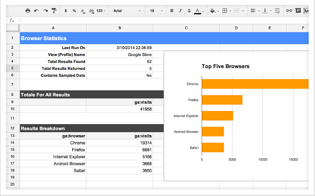
Developed by Google Engineer Philip Walton, this spreadsheet add-on makes it easy to pair up your extensive Google Analytics data with the data manipulation tools in Google Spreadsheets. For you, this means better data visualization that you can share quickly and easily with your team.
Features include:
- Privacy controlled data
- Scheduled reporting
- Embedding visualizations on third-party sites
- Finding and reporting on data from various viewpoints
- Computing and analyzing custom data reports
Use This Add-On If:
You are required to produce various Google Analytics reports on a regular basis. Automation features with this add-on makes reporting simpler, faster, and easy to examine.
Cost: Free
Google Tag Manager
Tag manager for Google Analytics helps you create and update tags for both mobile and website applications without having to write any code. With this add-on, you can launch fresh tags fast without having to wait for monthly code updates. Plus, debugging features help ensure your tags are reliable and working properly.
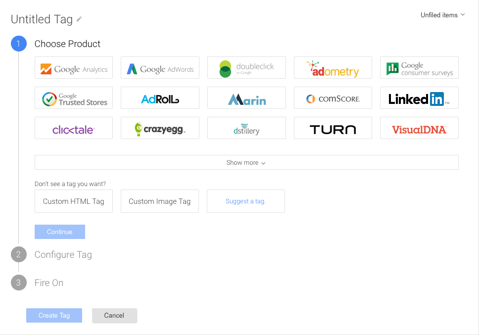
With the data collected by your tags, you can create stronger campaigns and make more informed decisions that help you get the most out of your marketing efforts.
Features include:
- Flexible tag firing for event-triggered data collection
- Multi-account access with user permissions
- Debug mode for verifying new tags
- Multi-device functionality with simple refrigeration
Use This Add-On If:
You have multiple campaigns running at once and often need to launch tags quickly to respond to real-time events.
Cost: Free
Debugger for Google Analytics
Using Chrome, this add-on uses the debug version of Google Analytics Javascript for all sites. Error messages and warnings are printed in the Javascript console so you can identify any tracking codes that aren’t functioning properly and never miss an important segment of Google Analytics data. Plus, the debugger sends a detailed report of each tracking beacon so you can find tracking code errors and missing data from your reports.

This add-on specifically helps spot incorrect method names, when the method name is cased incorrectly, strings containing leading or trailing whitespace, and when you’ve passed a non-string value using quotes.
Use This Add-On If:
You can’t afford errors in your tracking codes. We’re all human—mistakes happen. This add-on keeps you from making costly tracking mistakes by finding and alerting you of bugs (so you can fix things quickly without having to hunt down the problem.)
Cost: Free
Infinity Call Tracking
This call tracking add-on allows you to integrate your call data with Google Analytics (and Google AdWords) so you can study information such as call length, lead source, and other custom dimensions. Infinity also provides quality insights and ratings that can help to improve customer service efforts and streamline processes related to handling incoming calls. Site visitors are tracked via a custom phone number that ties in with their unique Google Client ID.
With availability in more than 50 countries, this add-on offers versatility to a wide variety of organizations and prides itself on easy integration with various CRMs so that no call goes untracked.
Use This Add-On If:
You’re interested in tracking your call data in tandem with website visitors. What once was difficult to study becomes infinitely insightful with this add-on.
Cost: Free trial available
Quill Engage
Quill Engage uses artificial intelligence to analyze your Google Analytics information and then transforms it into natural language reports that are easy to understand. Using this add-on, you can set up weekly and monthly email reports for different metrics, or run reports on demand.

Reports generated by this add-on include instant insights into different metrics (such as where site traffic is coming from) as well as actionable advice on where you can make changes to improve your site—all in a simple Word document format.
Use This Add-On If:
You don’t have time to write up detailed reports of Google Analytics data. This add-on makes it look like you broke down all of the detailed statistics into simple, actionable information.
Cost: Free with upgrades from $19.99-$49.99/month
Wordsmith for Marketing
If you need white-label Google Analytics reports as a marketing agency, Wordsmith for Marketing can help. This add-on generates professional-looking reports (written in plain English) that explain ROI in detail via charts, tables, and general notes.

Reports can be automated and sent to clients on a weekly, monthly, or quarterly basis and are 100% editable. Custom reporting dimensions include channels and parameters for conversion tracking.
Use This Add-On If:
You are an agency with multiple clients that need detailed reports on a regular basis. This add-on saves time and staff resources and makes analyzing detailed reports fast—so you can put those statistics to work for your customers.
Price: $250-$1,700/month
RegExr Regular Expression Tool
Google Analytics uses regular expressions (often called regex) to find patterns. Similar to what you learned in algebra class, these expressions work by discovering patterns within reports (like a table filter) and within separate report sets (like view filters). They’re also used to configure goal conversions and to define advanced segments and funnel stages.

RegExr is a free online tool that lets you build and test different regular expressions that then tie in with your Google Analytics to find interesting trends and patterns you may not have found otherwise.
Use This Add-On If:
You’re looking deep within Google Analytics to identify data trends that can increase conversions. This tool lets you work smarter (not harder) to spot patterns that you can then leverage to increase effectiveness with your online strategy.
Cost: Free
Table Booster
Table Booster is a Chrome add-on that improves the information grid within Google Analytics by creating three different types of visual representations for each metric.
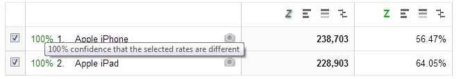
Whether you need a bar chart, a heat map, or a grid, you can turn your metric data into simple visuals that are easy to understand. Bonus: This tool also allows you to compare two rows for rate difference via a Z-test that finds statistical significance.
Use This Add-On If:
You need to turn your Google Analytics into visual representations. If your team’s eyes glaze over at a report full of numbers, this might be a good way to bring greater understanding to trends and patterns within Google Analytics.
Cost: Free
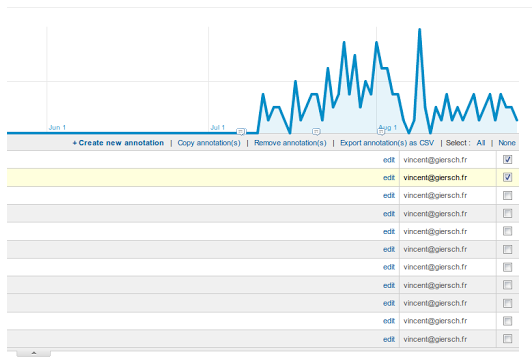
Annotations Manager
If you need to copy annotations, remove multiple annotations, or export notes as a CSV, you can use this Annotations Manager in Firefox (thanks to Vincent Giersch.)
Use This Add-On If:
You’re tired of wasting precious time on annotations within Google Analytics. Annotations Manager lets you make multiple edits all at once instead of having to go through each individual line item.
Cost: Free
Campaign URL Builder
Using this add-on, you can save a few steps while generating custom URLs within Google Analytics.
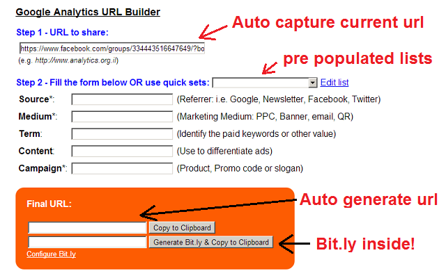
This more robust version of the Google Analytics URL Builder has increased functionality, which includes:
- Creation and management of pre-configured tag sets
- Auto generation of final URL
- Copy button
- Bit.ly integration using official Bitly API
- Default pre-defined tag set for automatic complete tag URL
Use This Add-On If:
You use Bitly links in your campaigns and hate having to switch between screens to generate links. This add-on can speed up the campaign URL generation process so you have more time to focus on results.
Cost: Free
UserReport.com
UserReport.com syncs with Google Analytics to fill in data gaps. Using surveys, UserReport asks site visitors questions about their gender, income level, and other custom dimensions, and then integrates with your existing Google Analytics data.
UserReport then helps you find in-depth information about conversion paths and learn exactly who your target customers are online.
Use This Add-On If:
You need deeper data about your website visitors to further define your niche online.
Cost: Free
Analytics Edge Add-In
If you use Microsoft Excel to manage your Google Analytics data, the Analytics Edge add-on allows you place query results anywhere on a worksheet that refresh with one click.
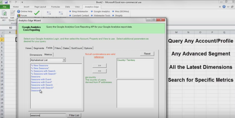
This means you can have multiple queries, used advanced segmentation, and search for specific metrics all within a single custom spreadsheet. The free version works for single channel data.
Use This Add-On If:
Your Google Analytics data lives in a custom MS Excel spreadsheet. Using this tool, you can update information quickly (and without having to export and import new information every time.)
Cost: Free
OWOX BI ROI
Thanks to OWOX BI ROI, you can calculate daily cost data of your external ad campaigns and to upload it to Google Analytics. Thus, you can compare your PPC efforts via Bing, Yahoo, Facebook, and other platforms all in one place.

Once it’s setup, you can study the cost, clicks, impressions, and more from your AdWords and non-AdWords campaigns to discover which advertising channels are bringing you the most ROI (without switching screens.)
Use This Add-On If:
You need ROI data for external advertising campaigns side-by-side with your online advertising mediums so you can identify what really works.
Cost: Free
Live Site Search Visualisation
Need to visualize user search data in real time? The Live Site Search Visualisation add-on accesses the Google Analytics real time reporting API to showcase live search activity with colored tiles.

Now you can see what people are looking for at any moment within a colorful display that’s easy to read.
Use This Add-On If:
You want to leverage your Google Analytics data for an insightful art piece within your workspace.
Cost: Free
Save Time With These Google Analytics Add-Ons
Your time is precious. Use these add-ons to make time spent analyzing Google Analytics data more effective and efficient (so you can get back to the other million things on your to-do list.)
Plus, they might even help you find that missing metric you weren’t quite sure how to track.
Are there any other add-ons you’d put on this list?
About the Author: Kaleigh Moore is a freelance writer and social media consultant who works with SaaS companies to create interesting, insightful content people actually want to read. Find her on Twitter @Kaleighf.


